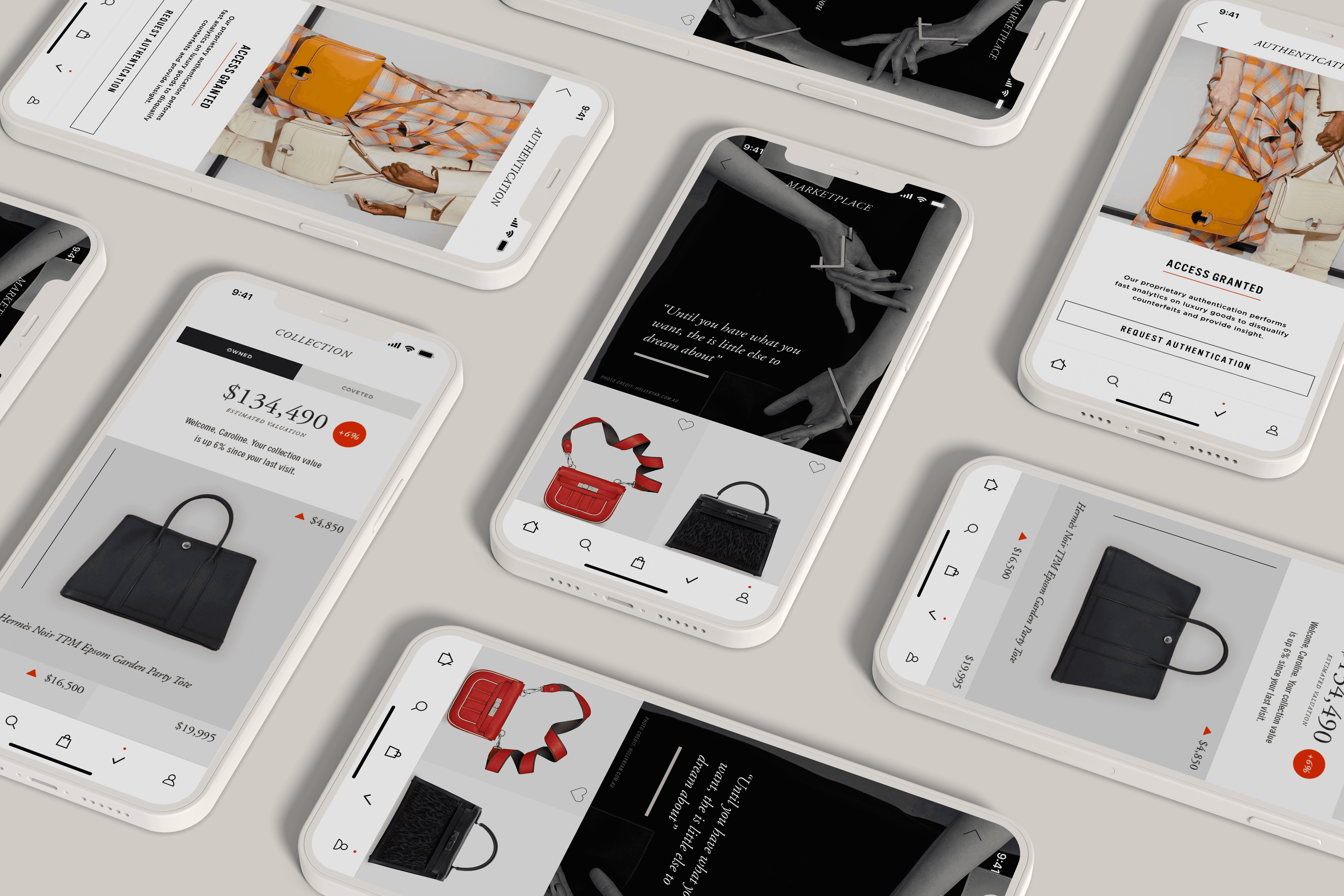
A second-hand luxury marketplace which provides buyers and sellers with invaluable insight into the pricing and authenticity of products. Collaborated with iOS developers by handing off designs for essential features.
ROLE
UI/UX designer
TEAM
UI/UX designer, and Mobile app developer
DURATION
December 2020 to February 2021 (3months)
My Contribution
I designed key interfaces for the marketplace & insights platform including the home screen, verification page, search interface, settings, and more. Adhering to the brand's style guide during the process was essential to ensure the screens aligned with the brand's identity.
Uncovering issues
Brief
Covetthy is an online platform designed to assist purchasers and vendors in understanding the value, appeal, and genuineness of items within the pre-owned luxury market. This platform was essential due to the increasing number of customers entering the industry, ensuring they continue to relish their buying experience.
Problem
The prior method of shopping involved reaching out to the sales manager or accessing the entrepreneur's eBay account. The business owner desires a self-sufficient platform that would improve the management of her enterprise. This not only distinguishes her from competitors, but also enhances customers' purchasing experiences, allowing the business to retain recurring clients.
Goal
Since this was their initial app launched for customers, improving the purchase experience is vital.
Final results
Design 1
Collection
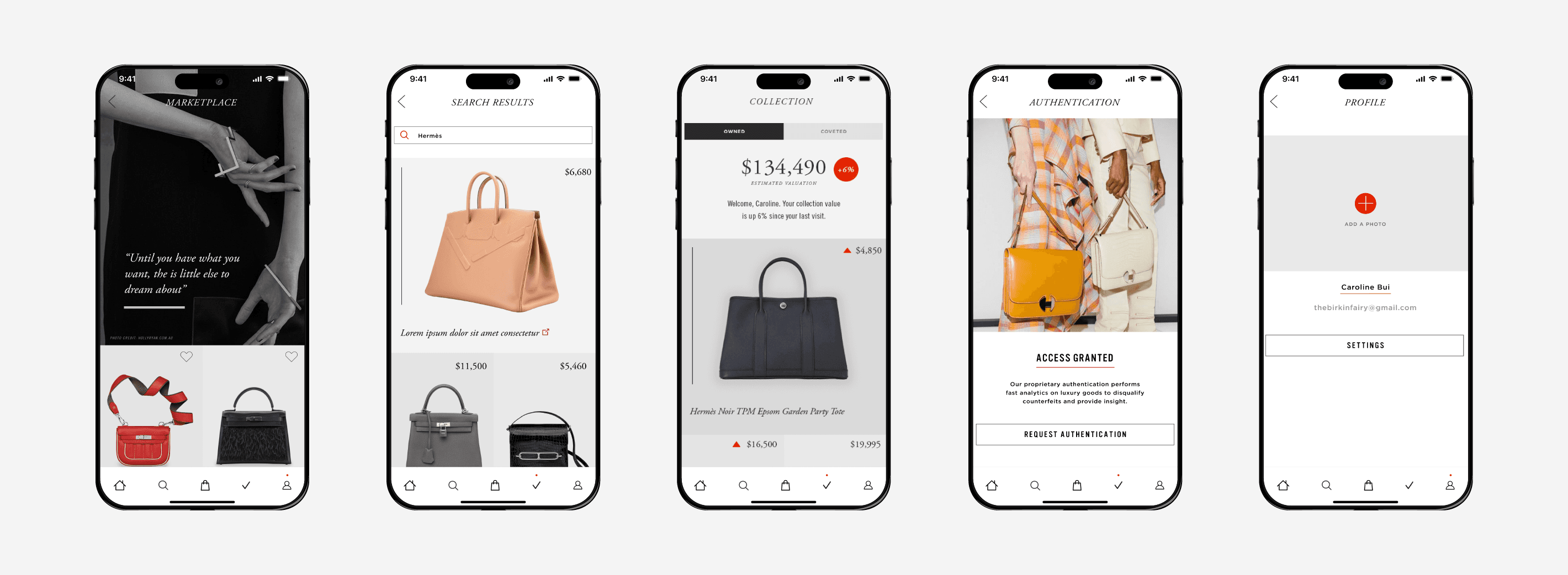
A user’s owned COLLECTION is one of the most important screens in the app. This screen gives them an overview of their collection’s total worth, whether that value has gone up or down, and information on each owned piece within their closet.
Design 2
Main screens
Straightforward, yet insightful pages are developed. The user can promptly reach each primary screen through the bottom navigation bar. Image choice, the typeface, and the color palette play a significant role in upholding the brand identity of Covetthy.
Past Iterations
In place of splitting the "Task" and "Sensors" sections into two columns, I arranged them in rows. By consolidating sensor data and alerts into a single row, I discovered this to be the optimal configuration during the iterative design phase. Furthermore, presenting all information within one row simplifies the overall structure, easing the experience for the user.
Design 3
Login & Settings
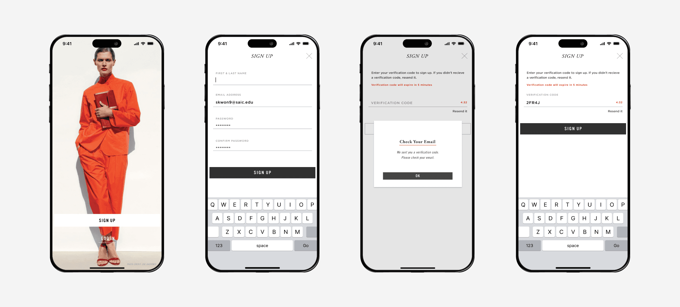
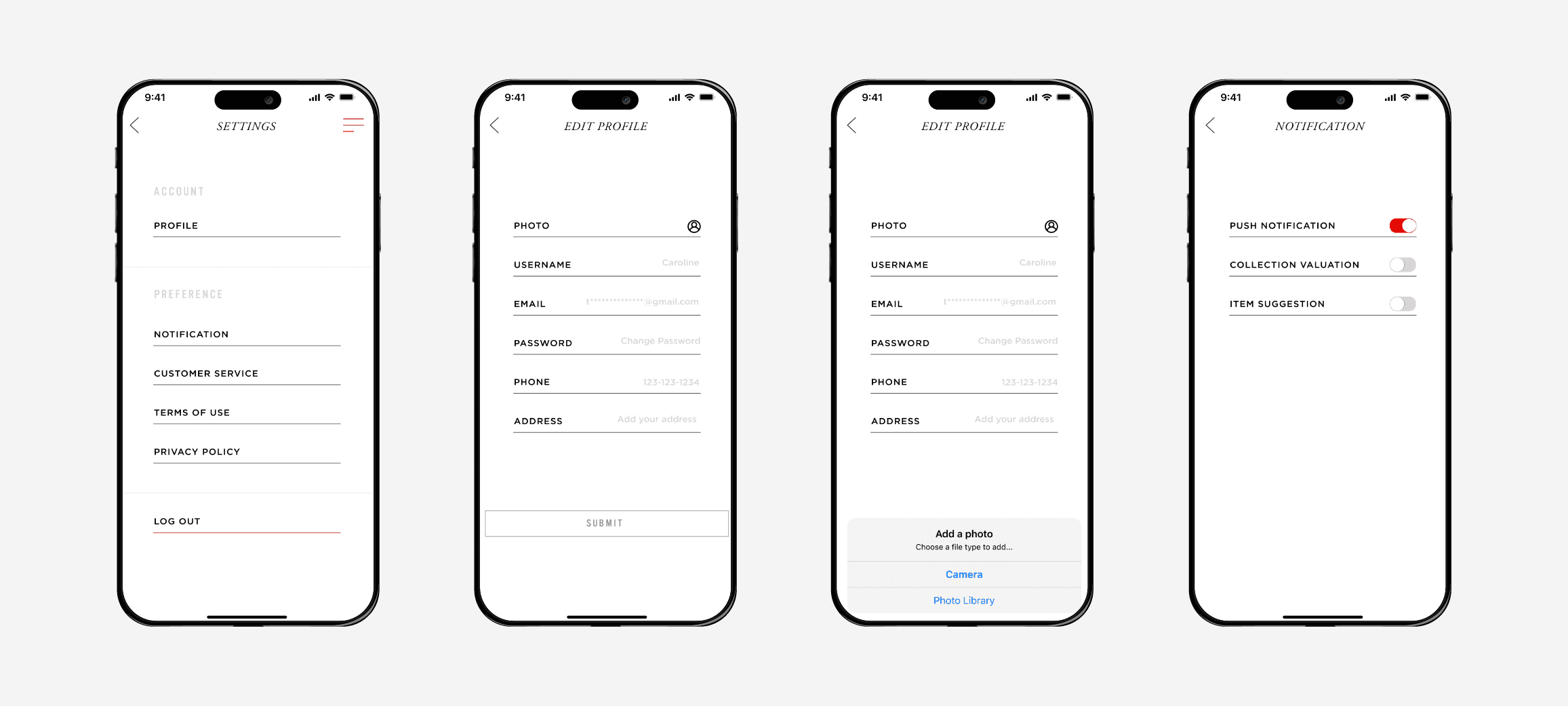
The design of the onboarding and settings screen focused on optimizing user experience and intuitive interactions.
Research & ideation
Target Audience
Clients of Birkin Fairy :
High end collectors who have purchased items and plan to buy additional products.
Insights
What affluent customers desire to view via the Covetthy application?
They seek not only to discover the expert's recommendations, but also to view their total assets through an app that updates the values live.
Information Architecture
Designing the Product
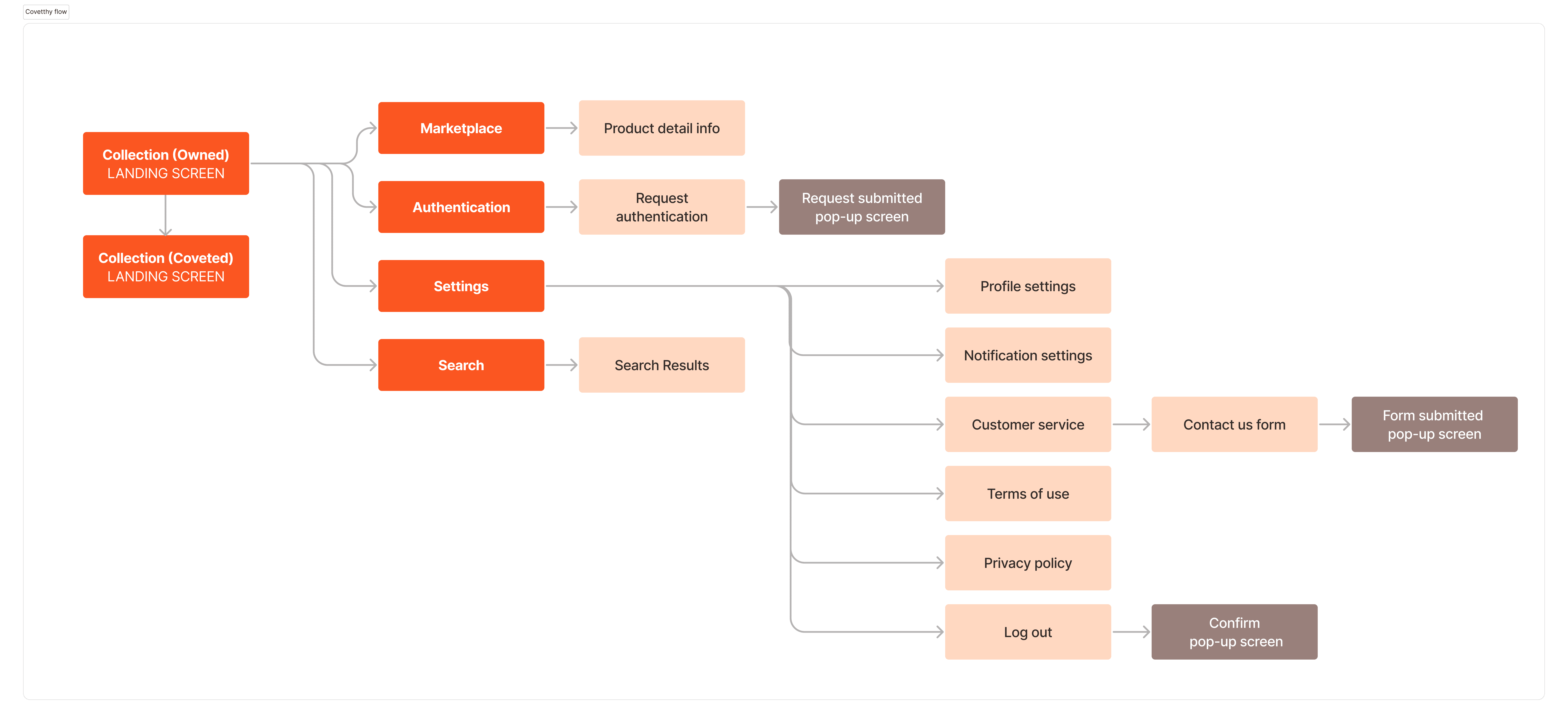
The user bought to examine their present assets (inventory) alongside the marketplace inventory. They may peruse the recommendations and blog articles for ideas or knowledge about products. They can also upload their existing item information to the app to obtain authentication.
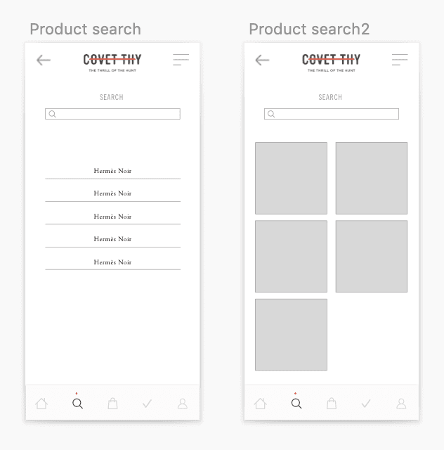
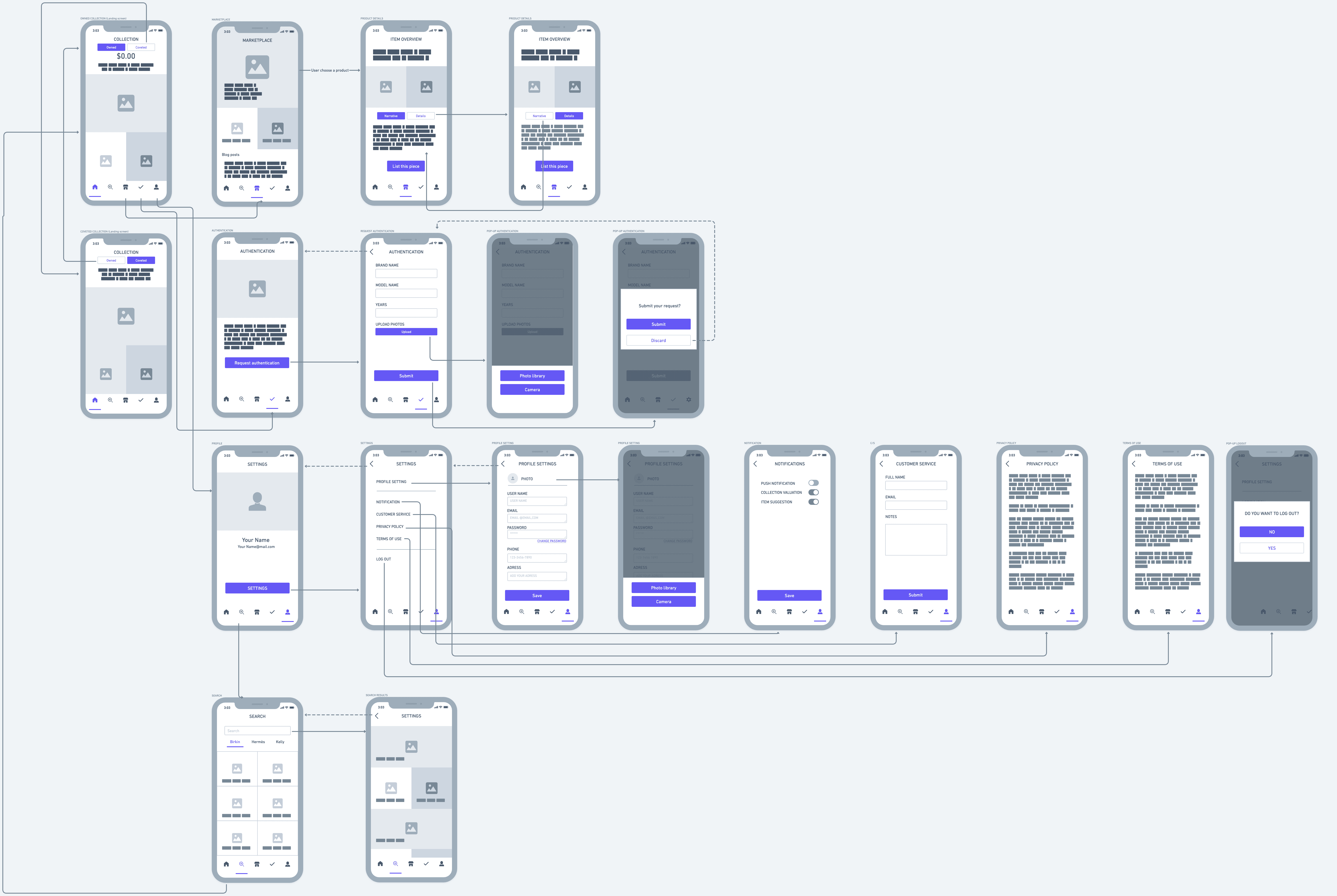
Low-fi Wireframes
retrospetive
Takeaways
Preserving brand identity in mobile app design.
By utilizing material guidelines, paying close attention to typography and color design systems. I was able to design an app interface which adhered and complemented the brand guideline for this luxury identity.

